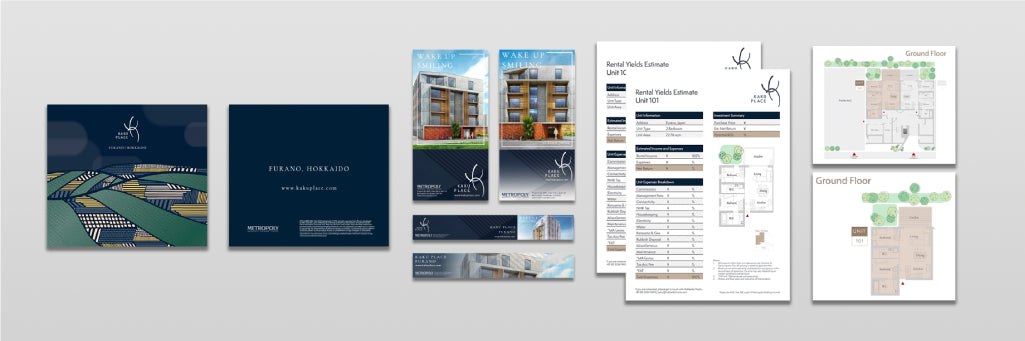
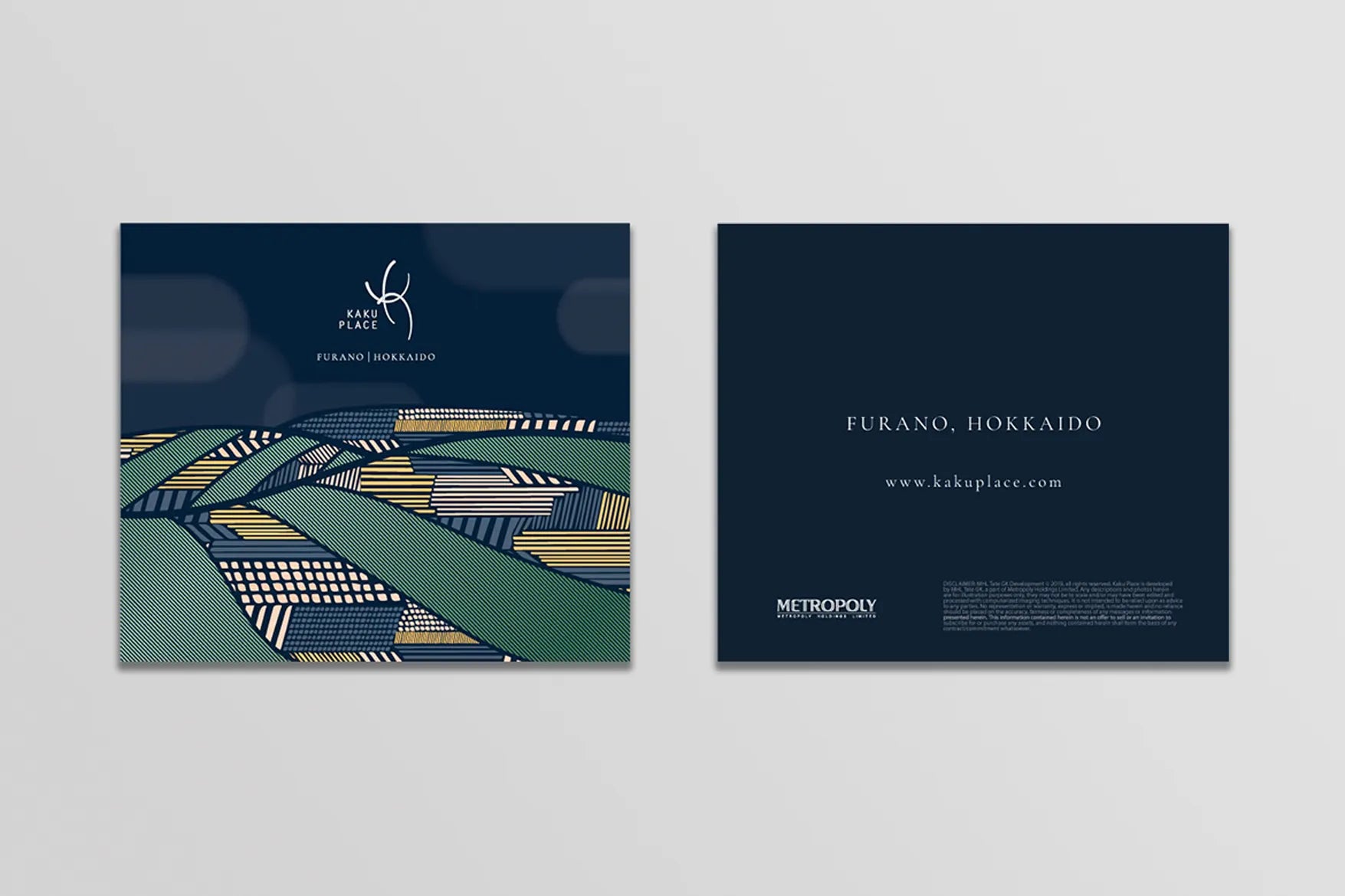
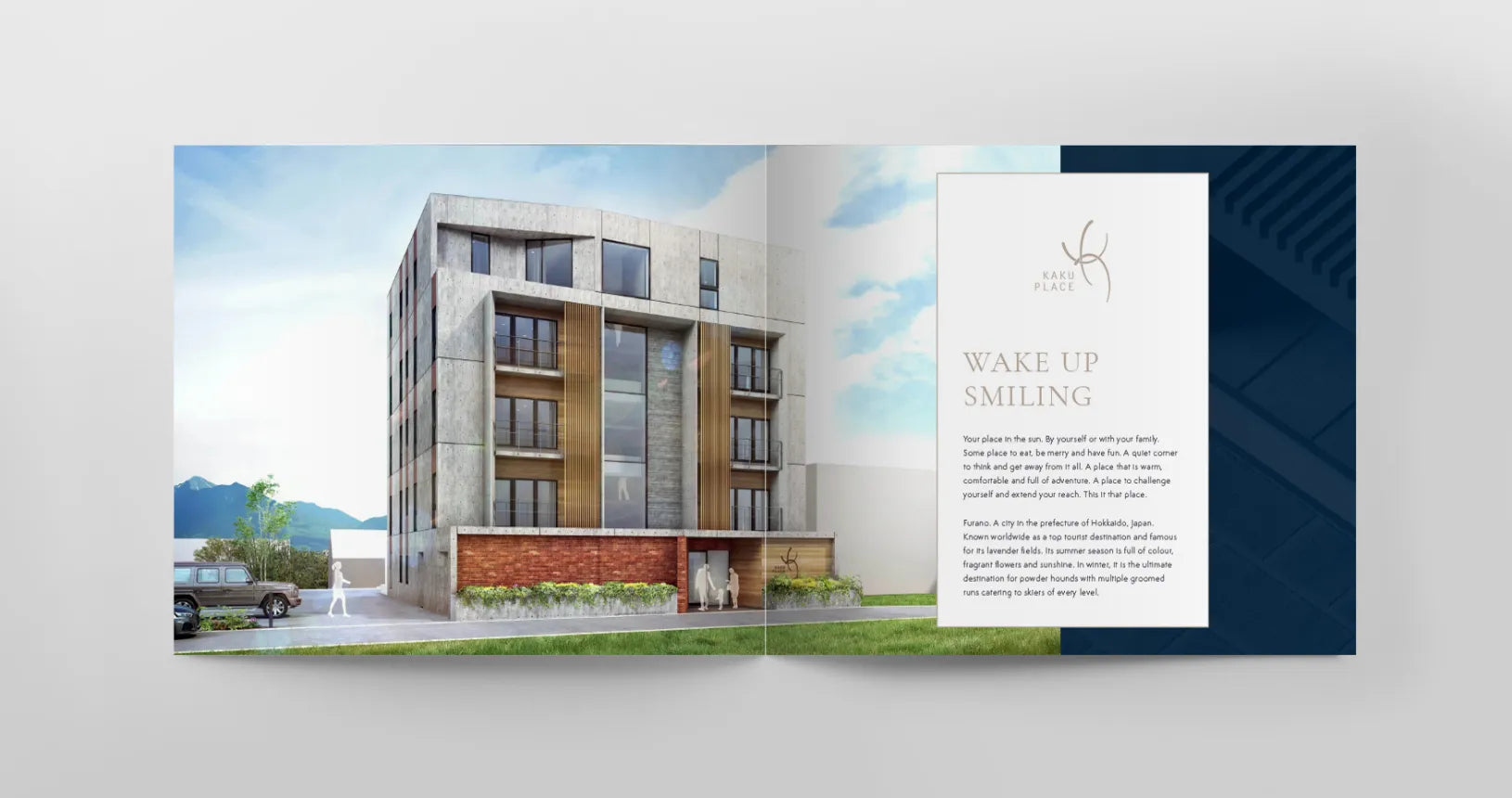
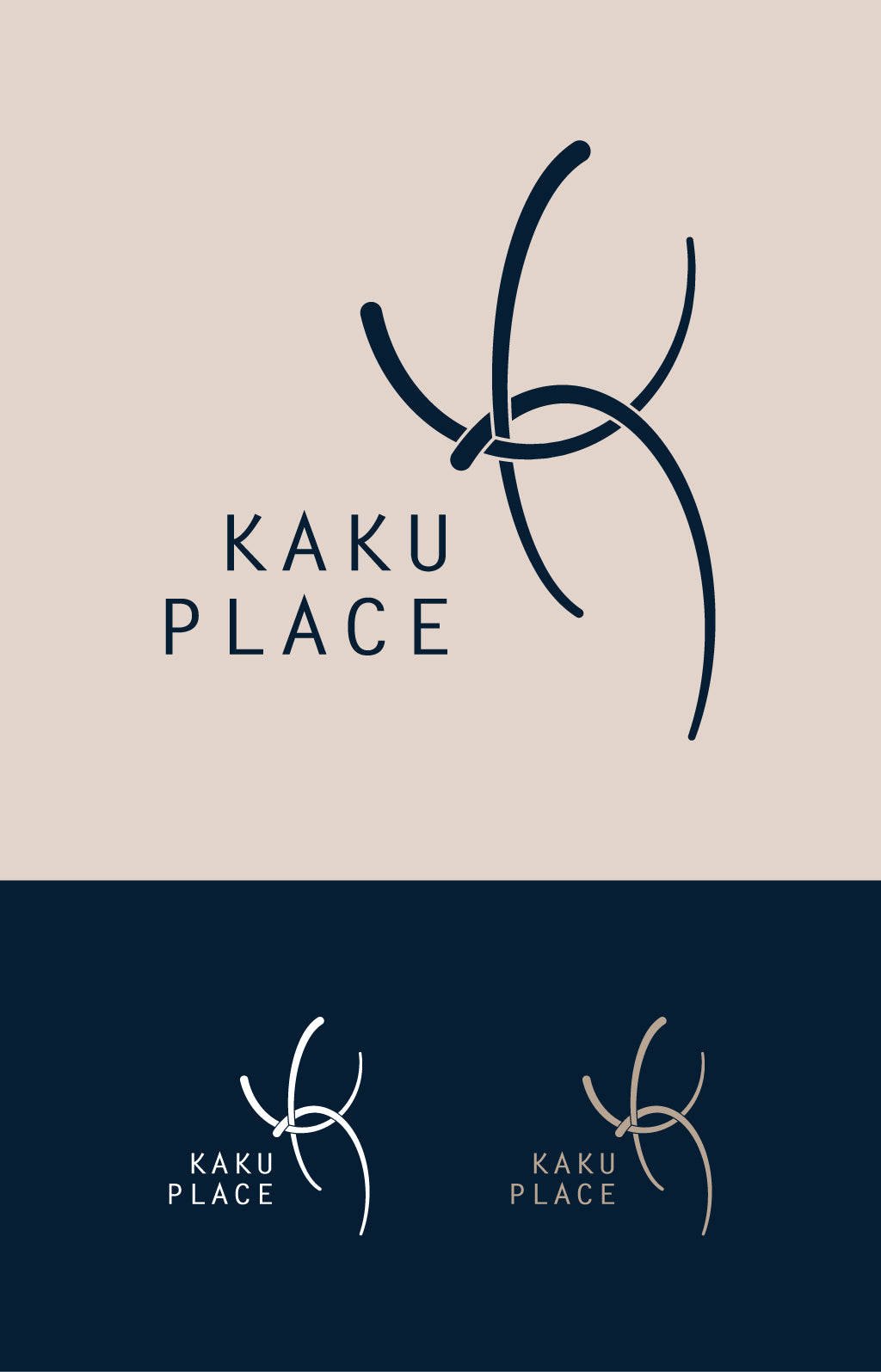
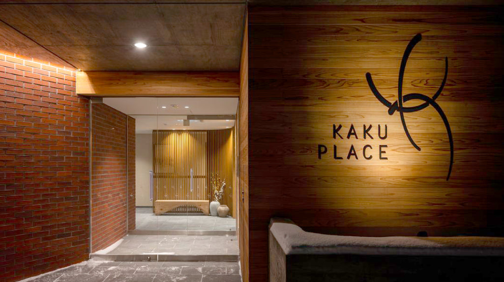
KAKU Place

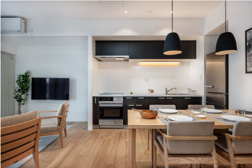
Wake up smiling
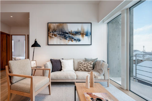
The typography of the project was very clean, with a strong and natural Japanese aesthetic. Targeted for young investors and families, it was important that the representation of the brand was classy but also cosy and approachable.
Field: Real Estate Development
Type: Visual Identity - Print/Digital Design, FF&E Coordination
Year: 2020